6 Landscaping Website Examples That Get Calls (and What They Do Right)
Most lists of landscaping websites are picked for looks: big hero photos, slick animation, companies with hundreds of employees. That’s not much use if you run a crew of five and want the phone to ring.
So this list is judged differently. Each site below belongs to a local landscaping company, and each one was picked for what happens in the first few seconds on a phone — whether a homeowner can tell what you do, where you work, why they should trust you, and how to get a price. That’s what turns a visit into a quote request. Looks come second.
What a landscaping website actually has to do
A homeowner looking for a landscaper usually has two or three names from Google or a neighbor and is deciding who to call first. Your site has about one screen to answer four questions:
- What do you do? Lawn care, design and build, hardscapes, irrigation — say it in plain words.
- Do you work where I live? Name the city and the areas around it.
- Can I trust you? Years in business, reviews, licenses, real photos of your own work.
- How do I get a price? One obvious button, and a phone number that dials when tapped.
Every example below answers all four before you scroll.
The examples
1. Grass Works — Austin, TX
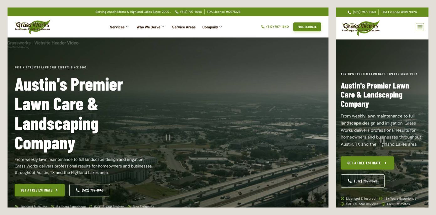
This is the most complete first screen on the list. Before the logo, a thin bar carries the phone number and the company’s Texas irrigation license number. The headline says what and where in one line: Austin’s Premier Lawn Care & Landscaping Company. Under it, two buttons — a free estimate and the phone number again — and then a row of proof: licensed and insured, 18+ years, 530+ five-star reviews.
Steal this: put the numbers that make you safe to hire — license, years, review count — on the first screen, not on an About page nobody opens. A license number is a small thing that tells a homeowner you’re the real deal.
2. Alex’s Lawnscape — Charlotte, NC
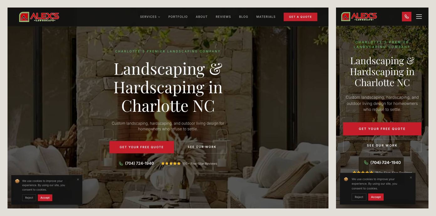
The headline is almost boring — Landscaping & Hardscaping in Charlotte NC — and that’s the point. It’s exactly what someone typed into Google, so they know instantly they’re in the right place. One red button, Get Your Free Quote, is the only loud thing on the page. Right under it: the phone number and 150+ five-star reviews, with a link to read them all.
Steal this: one main action, in a color nothing else on the page uses. If everything is a button, nothing is.
3. Sanchez Landscape — Austin, TX
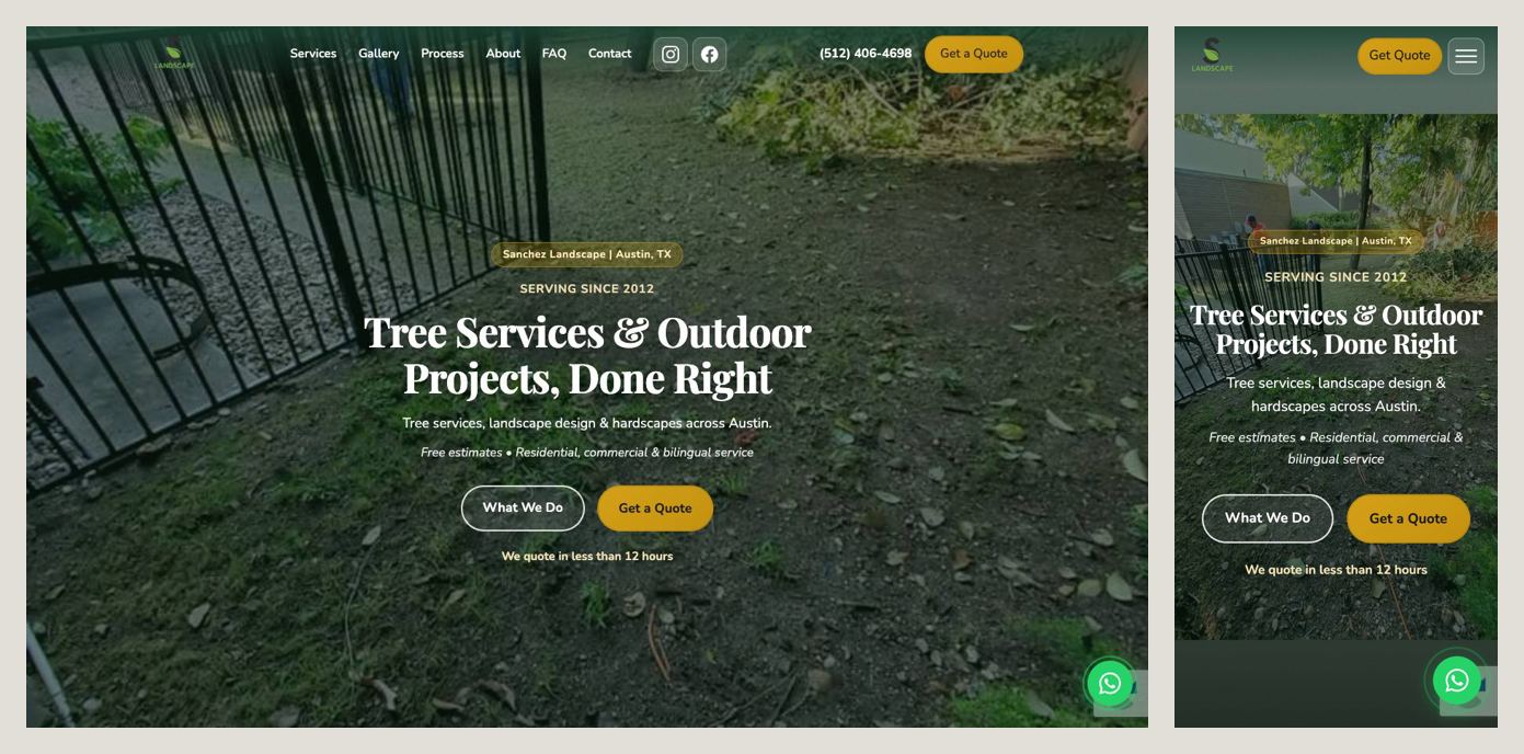
Two details make this one stand out. First, a specific promise right under the buttons: “We quote in less than 12 hours.” Every landscaper says “free estimate”; very few say when. Second, it meets customers where they already are — a bilingual team (Hablamos Español) and a WhatsApp button next to the phone and the form.
Steal this: replace a vague promise with a number. “Fast quotes” means nothing. “A quote within 12 hours” is something a homeowner can hold you to — which is exactly why it’s convincing.
4. Austin Creative Landscaping — Austin, TX
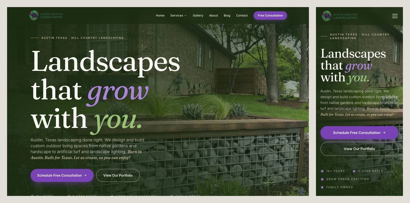
This one sells design and build rather than weekly mowing, and it reads that way: a warmer headline (Landscapes that grow with you), a short paragraph naming the work — native gardens, hardscape, turf, lighting — and a purple Schedule Free Consultation button. The trust strip is local and specific: 16+ years, 5-star rated, Grow Green certified, family owned. Grow Green is Austin’s own landscaping program — a badge that means something to people there.
Steal this: if your jobs are bigger and slower, ask for a consultation rather than a quote, and lead with credentials your own city recognizes.
5. Arterra Landscape Design/Build — Denver, CO
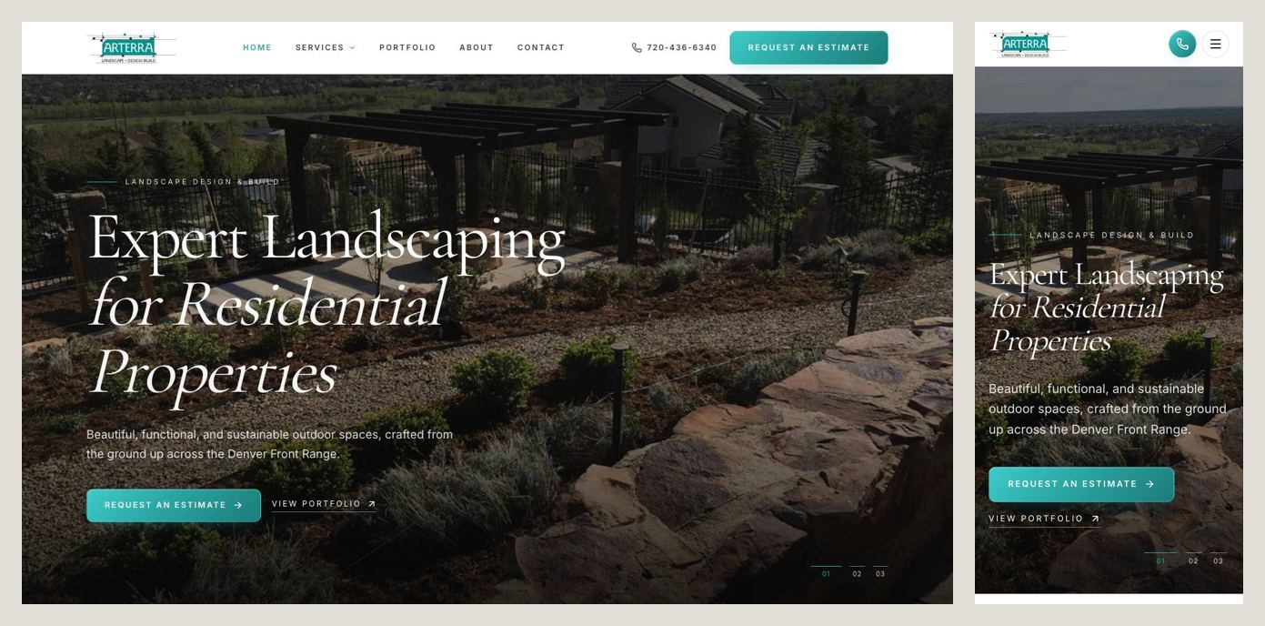
A design studio’s site: a dark photo of their own finished work, an elegant headline, and very little else. It still does the job. The service area is named in the first sentence (across the Denver Front Range), Request an Estimate is the main button, a portfolio link sits right next to it, and on the phone a call button stays in the top corner. Further down, one line quietly adds urgency: projects are booked first come, first served.
Steal this: a minimal, high-end look works fine as long as the minimum still includes where you work, a way to ask for a price, and your own photos.
6. Highlands Landscaping — Denver, CO
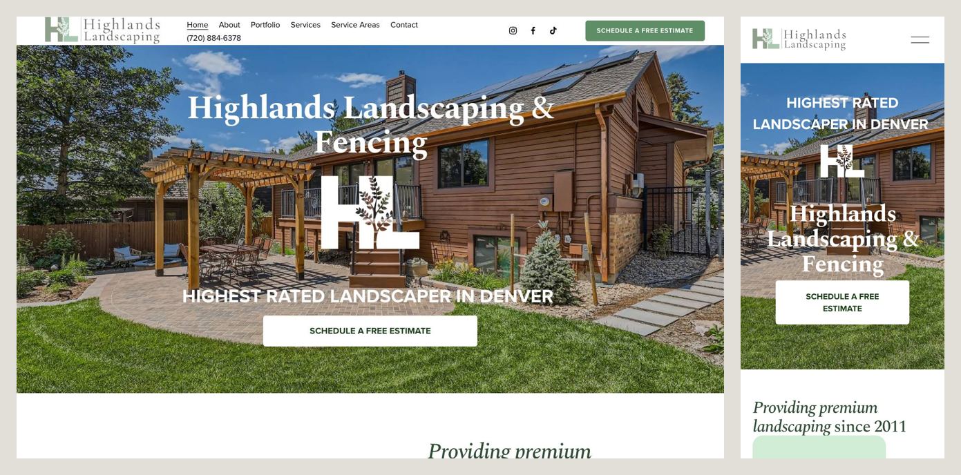
Simple and confident. A real project photo — a pergola and patio, not a stock image — the company name with its second specialty right in it (Landscaping & Fencing), a bold claim (Highest Rated Landscaper in Denver) and one white button: Schedule a Free Estimate. The phone number sits in the header on desktop.
Steal this: if you do a second trade well, like fencing or irrigation, say so up front. Someone who needs a fence and a new yard would rather call one company than two.
What they all have in common
Put the six side by side and the pattern is hard to miss:
- The city is on the first screen. Usually in the headline.
- One main button, and it asks for a quote, an estimate or a consultation — never “Learn more”.
- A tappable phone number. On a phone, a number that doesn’t dial when tapped is a number most people won’t bother to copy.
- Proof near the top: years in business, review counts, licenses, local certifications.
- Their own work in the photos. Not a stock picture of a house that could be anywhere.
The mistakes that cost calls
Looking at a few dozen landscaping sites for this article, the same problems kept coming up on the ones that didn’t make the list:
- A headline that says nothing. “Always Growing” or “Quality You Can Trust” could be a bank. Say what you do and where.
- “Learn More” or “Read More” as the main button. Nobody wants to learn more. They want a price.
- A wall of text on the first screen. If the opening is a 120-word paragraph, a visitor on a phone sees no button at all.
- Headlines written for Google instead of people, like “Landscape Companies Denver CO – Company Name”. Search engines are smarter than that now, and customers find it odd.
- Pop-ups stacked on the first screen — chat widgets, cookie banners, accessibility toolbars — covering the one button that matters.
- No phone number on the phone version, or one hidden behind the menu.
A checklist for your landscaping website
Before you change anything else, check the first screen on your own phone:
- What you do, in plain words
- Your city and service area
- One clear button: free quote, estimate or consultation
- A phone number that dials when tapped
- At least one proof point: years, review count, license or certification
- A photo of a job you actually did
Further down the page:
- Your services, each in a sentence or two
- A gallery of your own work, ideally before and after
- Three or four real reviews, with first names and neighborhoods
- A short quote form — name, phone, address, what you need — or a text/WhatsApp option
- When you’ll get back to them, as a number: “within 24 hours”
Build it yourself, or have it built
You can build all of this yourself with a site builder: pick a template, swap in your photos, rewrite the copy with the checklist above open next to it. Plan on a few evenings and a monthly subscription. If you’d rather spend those evenings on actual jobs, that’s what we do: a custom one-page site with your photos, your service area and the copy written for you, live in five business days for a flat $1,000, with no monthly fees.
Either way, start with the first screen. It’s where most of the calls are won or lost.